Speaking - Building a Powerful Presentation
by Keith Elder and Sarah Kindinger
Building a powerful presentation starts away from the computer. Presentation tools like PowerPoint and Keynote are where we want to end up, but designing powerful slides first begins with brainstorming. Presentation tools were never intended to be brainstorming or drawing tools. These applications are containers for ideas, not the means to generate them. The key to a building a powerful presentation is design. Luckily, we've been designing this presentation from the beginning. Now we're ready to take the next step and add visual images to enhance our message.
Power of Storyboarding
Creating a storyboard outside of PowerPoint or Keynote allows you to see your talk laid out in sequence and easily move things around where needed. Garr Reynolds, author of "Presentation Zen," recommends using post-it notes for brainstorming and grouping to create your outline. Post-its can easily be arranged in the sequence of your talk. Using post-it notes instead of a computer allows you to easily rearrange, add and remove content without losing sight of the structure and flow. You can also create blank storyboards by printing out blank slides with three, six or nine slides per page.
Sketch out Visuals
Now that you have your core message and a rough storyboard with the details (i.e. data, stories, facts, etc.) for two or three sections of your talk, you're ready to begin thinking about visuals. What do you visualize about your ideas that'll make them memorable and accessible to your audience? Begin to sketch out images that will ultimately be turned into high-quality photographs, charts, slides with quotes. etc. Don't worry if you aren't an artist. These sketches are to help you paint an image of what you want the slides to look like.
Storyboard on the Computer
Garr Reynolds starts by creating a blank slide and then placing a simple text box inside with the size of font that'll be used throughout the presentation. Then, duplicate several of these slides because they'll contain the visual content of the presentation: single words, images, quotes, charts, graphs, etc. You may also want to add some contrasting slides at the end of each section of your presentation to give you visual closure to one section and to open a new section. These slides will be hidden or deleted after you've completed adding the visuals. Using this approach will help create a simple structure when you're viewing the presentation in the slide sorter. Now it's time to go back and add visuals that support the narrative without losing sight of the core message.
Use Design Principles
In his book "Presentation Zen," Garr Reynolds talks about the seven design principles and says these seven interconnected design principles are fundamental to good slide design.
Signal to Noise Ratio
This is the ratio of relevant to irrelevant elements and information on the slide. The goal is to have the highest signal-to-noise ratio as possible or more simply put, only have relevant content on the slide. The more stuff on your slides, the more distracting the message. There's a limit to the amount of information the human brain can process effectively and efficiently. To achieve this, we'll refrain from presenting inappropriate chart types, using ambiguous labels or icons and unnecessarily emphasizing items such as lines, shapes, symbols and logos that don't play a key part in the message.
This principle also applies to bullets on slides. Bullet points work well when used sparingly in documents to help readers scan content or summarize key points. Bullet points are usually NOT effective in a live talk. A general guideline is to use bullet points very rarely and only after careful consideration of the best options to display information to support your message. Don't let the default bulleted lists in software templates dictate your decision. The more text you have on your slide the less the audience is listening to you. They're too busy reading the information. Remember: The slides aren't the performance - you are!
Bad Example: 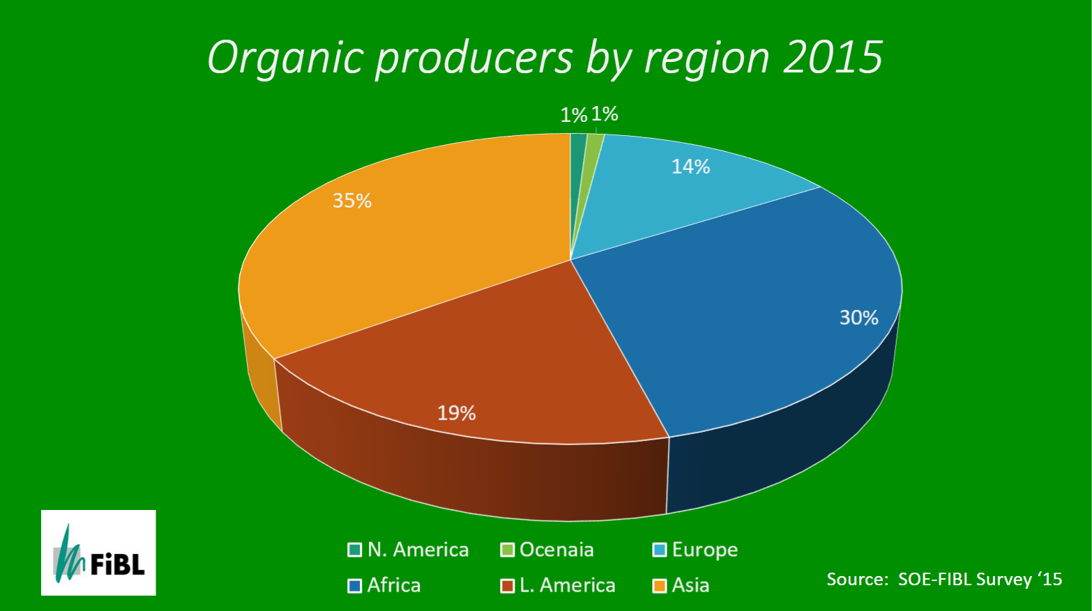 | Good Example: 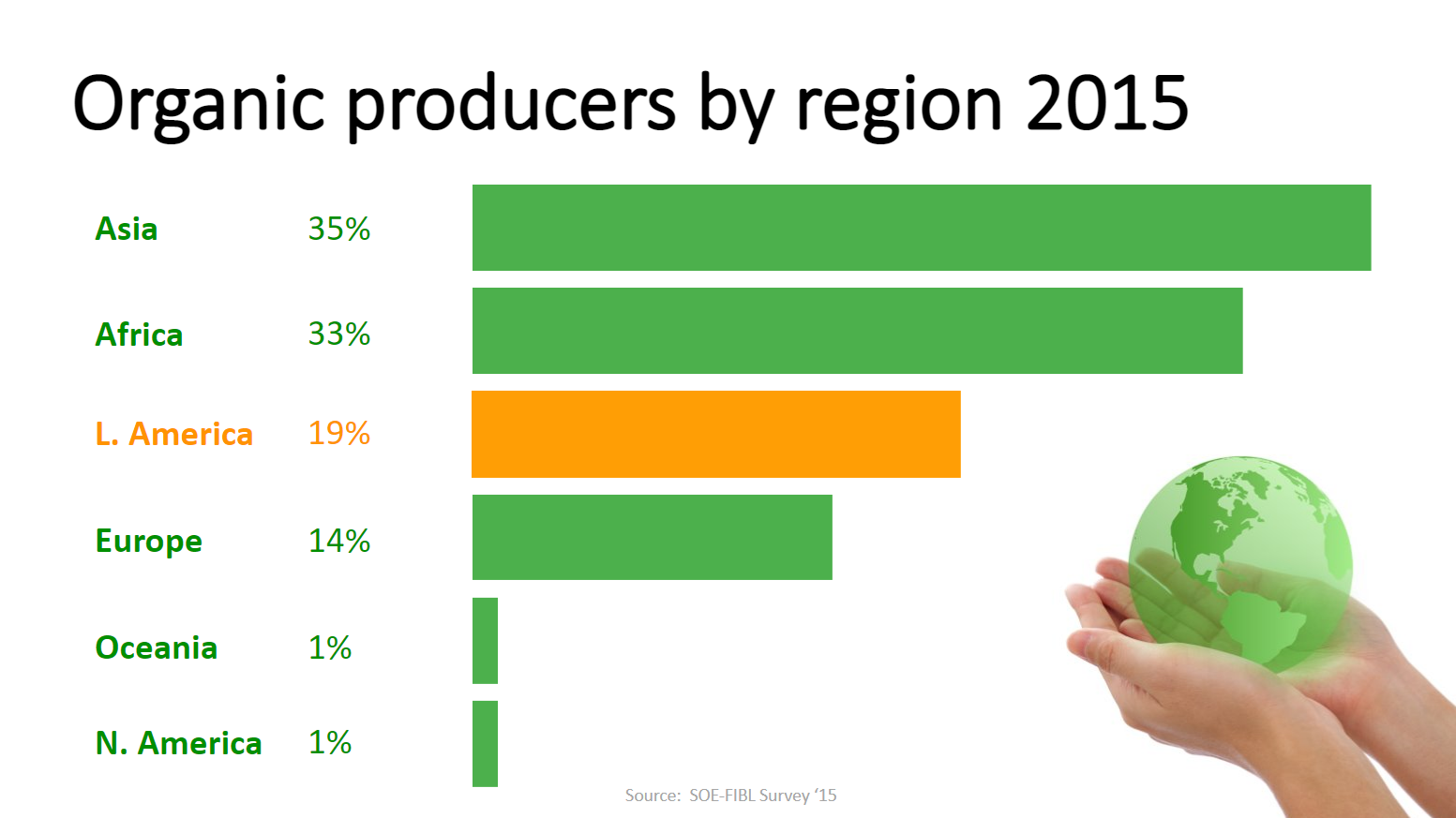 |
Picture Superiority Effect
Pictures are remembered better than words. When people are casually exposed to information and the exposure is for a limited time, images stick better. Visual imagery is a powerful mnemonic tool that helps increase learning and retention compared to someone reading words off a screen. We're hardwired to understand images and use them to communicate. When trying to go visual, ask yourself, "What information am I representing with the written text on the slide that I could replace with a photograph or appropriate image?" You may still need text for labeling, but if you're using text to describe something you could probably use an image more effectively. Images are powerful, efficient and direct. Always use high-resolution images and have them fill the whole slide.
Bad Example:  | Good Example:  |
Empty Space
Also called negative or white space, empty space is a concept that's really simple but can be the most difficult for people to apply. Our natural instinct is to fill empty areas with more things. Empty space implies simplicity and has a purpose. If you have one busy slide, look to see if you can break it out into multiple slides. Using empty space can help us look at slides in a different way and appreciate the power of what isn't included to make the visual message stronger. A well designed slide has good balance so the viewer never has to think about where to look. Placement of elements is another way to activate empty space and make it more dynamic. Using the rule of thirds can help you add balance to your slides. Placing elements in the middle of the slide can often make for an uninteresting slide. Garr Reynolds recommends creating a simple grid to divide your canvas into thirds. This helps with placing assets and gives them overall design balance, clear flow and a point of focus.
Bad Example:  | Good Example:  |
Contrast
Contrast simply means difference. Humans are wired to notice differences. This is one of the most powerful design elements and can be achieved in many ways like manipulation of space (near and far or empty and filled), color choices (dark and light, cool and warm), fonts (bold and narrow), positioning of elements (top and bottom, isolated or grouped) and so on. Contrast will give one element dominance and help the viewer get the point of your design quickly.
Bad Example:  | Good Example: 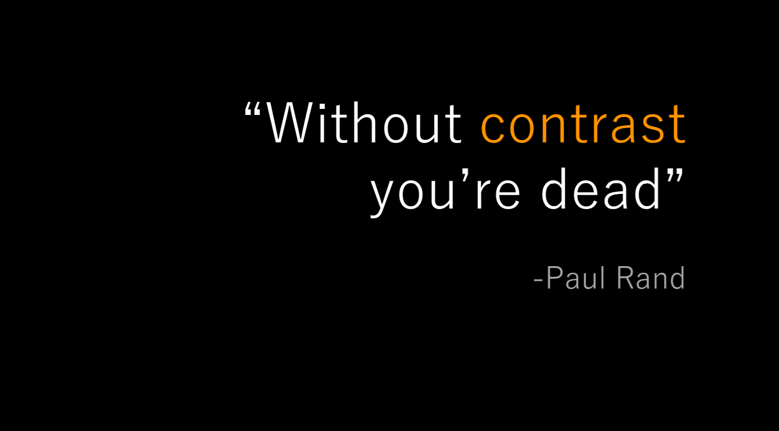 |
Repetition
Repetition is reusing similar elements throughout a design. Repetition can bring a sense of unity, consistency and cohesiveness. This can be achieved by using a consistent background and font throughout the slide deck. There is a careful balance and we don't want to overuse repetition which can make it difficult to distinguish between slides. Garr Reynolds provides the example in "Presentation Zen" that if you're going to use a starfish image in the lower left hand corner of slides for a presentation on marine biology, make it a stronger repetitive element by varying its size and location occasionally and in harmony with the content of the different slides, but subtly so that it doesn't interfere with the primary message.
Alignment
Nothing in your slide design should look like random placement. Every element is connected visually. Alignment is about obtaining unity among elements of a single slide. Even elements that are far apart should have a visual connection. This is easier to achieve with the use of grids. Make sure elements are connected visually and aligned to make your slides look more professional and be easier to understand.
Proximity
Move things closer or further apart to achieve a more organized look. Things that you want viewed together should be grouped together. Viewers will assume items not near each other are not closely related. The opposite is true, as well. Viewers will naturally group similar items into a single unit. We should never make our audience have to think about what caption goes with what graphic or if a line of text is a subtitle. Remember that a slide isn't a page in a book or magazine. When you look at a slide, notice where your eye is drawn first, second and so on. Then go back and make sure that's where you want the audience to focus, as well.
PowerPoint Tips
- ALWAYS use high resolution images
- Use the external speaking template
- Use 16:9 layout
- Font size
- Use size 36-40 for titles
- Use size 30-32 for main body content
- PowerPoint isn't your crutch and should enhance your story, NOT try to tell it for you. You should be able to tell your story without any slides.